Since the early days of CAP in 1996, we’ve had a passion to reach those who have been excluded because of their circumstances. We’ve prioritised face-to-face debt help, going the extra mile to provide the care our clients have needed. Working with local churches and food banks, we’ve offered our clients emergency help, spoken to their creditors and walked alongside them as they journeyed out of debt.
Our DNA
This is all part of our DNA at CAP, an organisation that represents the love of Jesus for all people. We believe that everyone should be treated with dignity, live in freedom and have equal opportunities, and we’re constantly seeking ways to make this possible.
Making a commitment
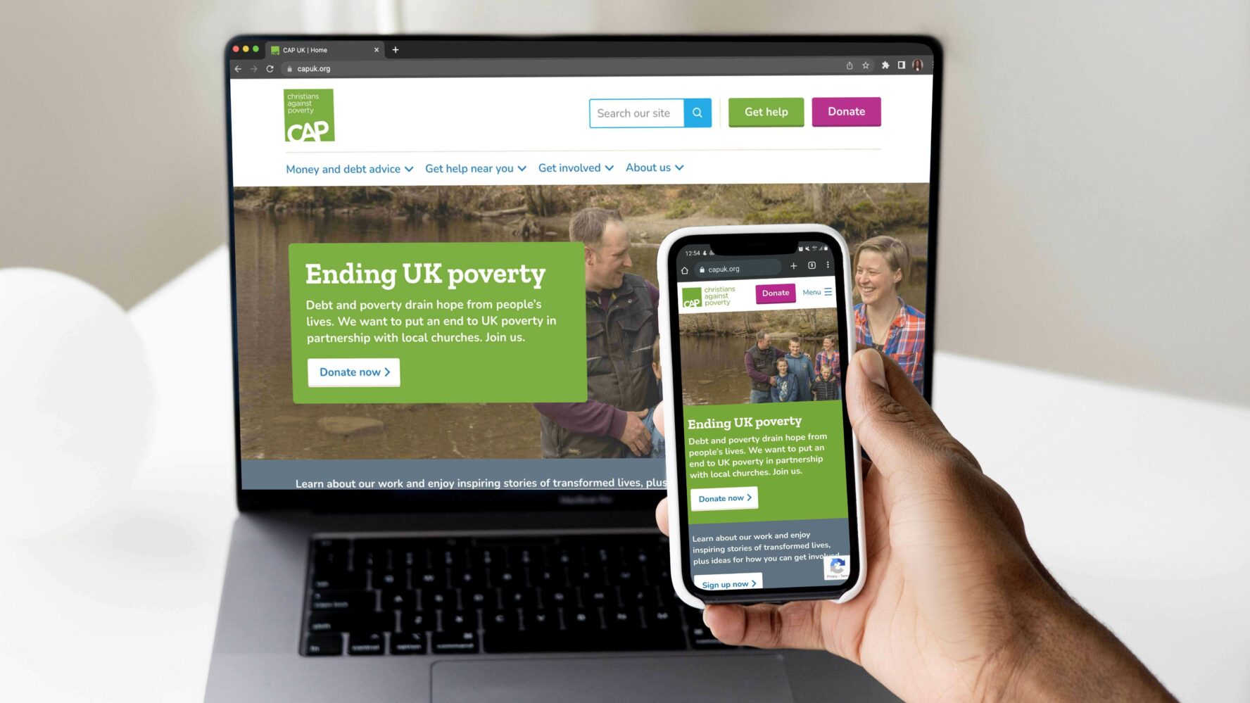
With our new website, this is something we committed to prioritising: accessibility. At CAP, we work with people who are often facing extra vulnerabilities or stressors, from physical and mental ill-health to relationship breakdown to extremely difficult circumstances. It’s important, therefore, that we make sure it’s easy for everyone to access our services, rather than putting extra barriers in the way that make our services inaccessible to those that need them.
Why the website?
An organisation’s website is often someone’s first experience of them, and acts like a shop window. If people are able to engage and interact with CAP through our website and find what they’re looking for, they’re more likely to ‘step inside’ and get the help they need, support CAP, or learn how they can work with CAP to help their community.
Because of this it is critical we get the experience right, so that people who need our help are not put off. Digital access is a massive problem for many people across the UK, preventing people from being able to engage in online spaces or access vital support and services. In 2022, it’s inexcusable that millions of people are unable to engage in digital spaces due to inaccessible, and simply put, unacceptable, design.
Did you know?
- Disabled people are over 50% more likely to face barriers to accessing digital and online services than those without a disability.
- 7 in 10 customers with a disability said they will click away from a website they find difficult to use.
Accessibility is for all
We believe with a passion that everyone who wants our help, or wishes to interact with us in any way, should not have to overcome needless barriers to access the support they need. 1 in 5 people in the UK has some form of disability – that’s 20% of the UK population, or 14.1 million people – and many more face access needs of all kinds. This statistic represents thousands of families that may be struggling with debt or looking to support our work.
Our mission in action
It is therefore vital that our new website is built with every kind of user in mind, from those with visual impairment or sensory issues, to cognitive or physical disabilities. This is why we’ve made sure to build following specific web accessibility guidelines, as well as implementing hours of user testing to make sure the content and user experience is the best it can be.
What’s new?
We’re always learning, but we’re excited to see some important changes now in action. Here’s a whole bunch of things we’ve improved on our new website to make it better for our users:
- We made sure our colours, fonts and contrasts were as easy as possible to read and in line with web accessibility guidelines.
- Using Plain English. It’s easy to slip into using jargon, so we follow the principles of Plain English, and use readability checkers to make sure we’re as clear and concise as possible.
- Built-in accessibility functions. We’ve built the website to include transcripts and built-in captioning on videos.
- Easy searching: we’ve added a search bar to make it easier to find what you’re looking for.
- Better function on mobile and tablet devices
- We’ve also included some new content, including:
- A place to manage your details, making it easier than ever to get in touch or make a donation
- A focus on key user journeys, for those looking for free debt help, wanting to support CAP, or for churches wanting to help their communities
- Advice on how to help or refer someone who is struggling
- A whole section on money and debt advice
We are adamant that no one should miss out on engaging with CAP due to accessibility barriers, and we hope that building on these foundations will help make our website (and services) more accessible to everyone.
Want to know more, or have any suggestions?
If you want to know more about the technical stuff, like guidelines we’ve followed and how we’re committed to improving accessibility, take a look at our accessibility statement.
If you see something on our site that you think we could improve, we’d love to hear from you. Get in touch by sending our Web Development team an email at [email protected].


